Library of Congress (LC) for Robots
Webpage Redesign
Sept 2021 - April 2022
UX Designer & Head of Analysis
Design Team
Figma, Miro, Canva, InDesign
───────────────
Client Overview
LC for Robots is a subset of the Library of Congress that provides access to APIs, bulk data downloads, and other related computational access points for Library of Congress collections.
Problem Statement
LC for Robots needs improved information architecture and instructional material to better support current users and attract new users to the Library of Congress's vast digital collections of data.
Project Goals
In order to reach a broader audience including researchers, analysts, students, and novice users, our team:
Identified the resources needed by expert and novice users
• Conducted interviews with current technical users to understand use cases
• Conducted usability testing, surveys, and questionnaires with expert and novice users to determine pain points and use cases
• Conduct A/B testing with users to assess accessibility needs
Developed a redesigned LC for Robots webpage
• Refined the list of digital data collections and feature the most popular resources
• Improve the time it takes users to find and access the information they are looking for
• Categorize all resources logically
• Incorporate instructional material and examples of use cases to improve accessibility for new users
• Improve on already existing LC for Robots branding guidelines
───────────────
Project Planning
This was a 3-month phase dedicated to understanding client needs, thoroughly planning the research and design phases, and acquiring relevant contacts.
View full Project Planning Report
───────────────
Research Phase
View full Research and Requirements Report
Research Results
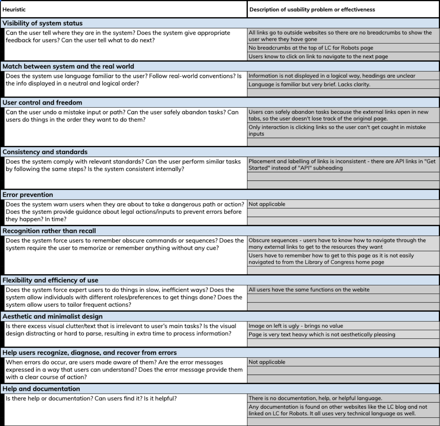
Heuristic Evaluation
LC for Robots webpage using Nielson’s 10 Usability Heuristics. Our evaluation showed that the key issues on the website were visibility of system status, recognition rather than recall, and help and documentation.
• Visibility of system status: All links lead users to external web pages. There are no “breadcrumbs” or navigation for users to know where they are within the site.
• Recognition rather than recall: Users must remember which links lead to different external sites with minimal contextual information about the features of each resource.
• Help and documentation: There is no documentation to help users navigate the site. All documentation for resources is housed on external sites and organized in different ways.
Web Traffic Analysis
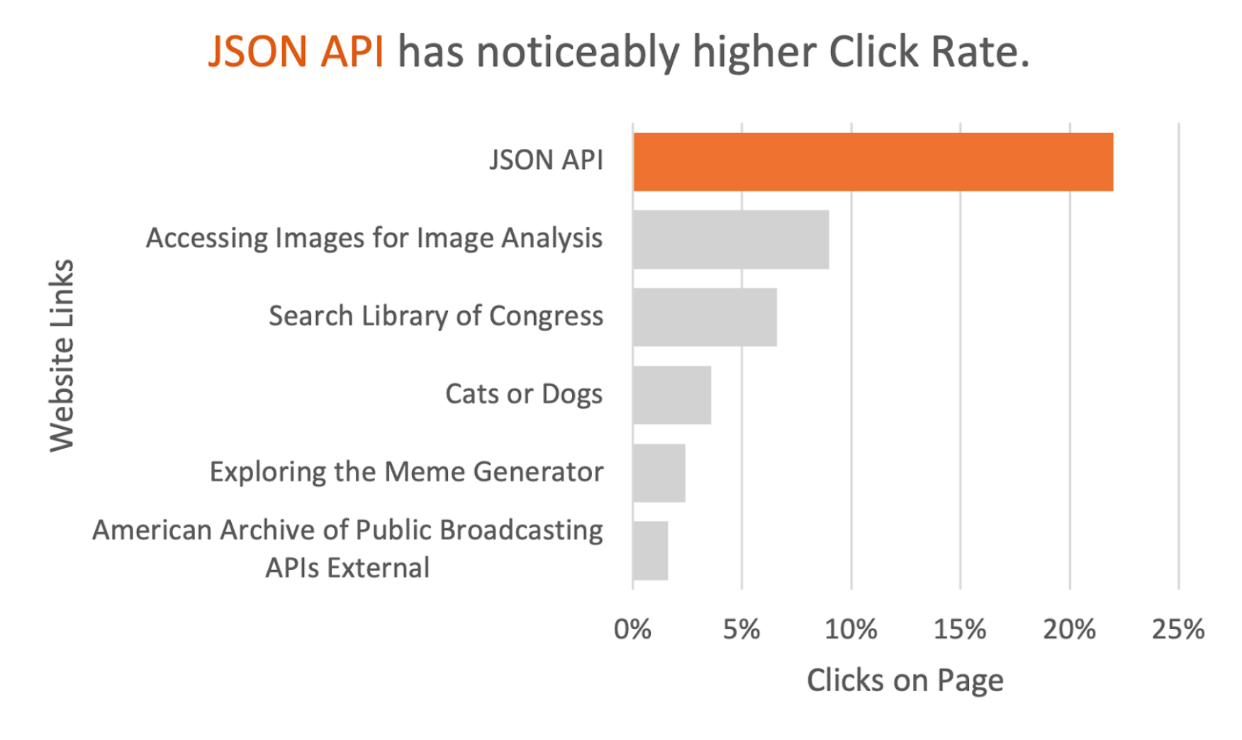
We conducted the web traffic analysis using the Adobe Analytics Report that highlighted usage data and user interaction information for the LC for Robots webpage.
The results of our analysis highlight the top-visited links and access paths to the LC for Robots site.
• The top visited link on the LC for Robots page was the JSON API.
• The top way users access LC for Robots is through the Library of Congress Github page, Google, and the MIT library pages.
Interviews and Usability Tests
We interviewed 6 participants in our interviews and usability testing stage that fell into two categories:
• 3 experienced users of bulk data downloads and accessing APIs, but have never used LC for Robots. These interviewees were professors at UMSI.
• 3 inexperienced users of APIs and bulk data downloads, and also never used LC for Robots. These interviewees were current undergraduate and graduate students at UMSI.
Combining our user interviews with usability tests allowed us to gain insights into typical user interactions, as well as learn about the user motivations when arriving at sites similar to LC for Robots.
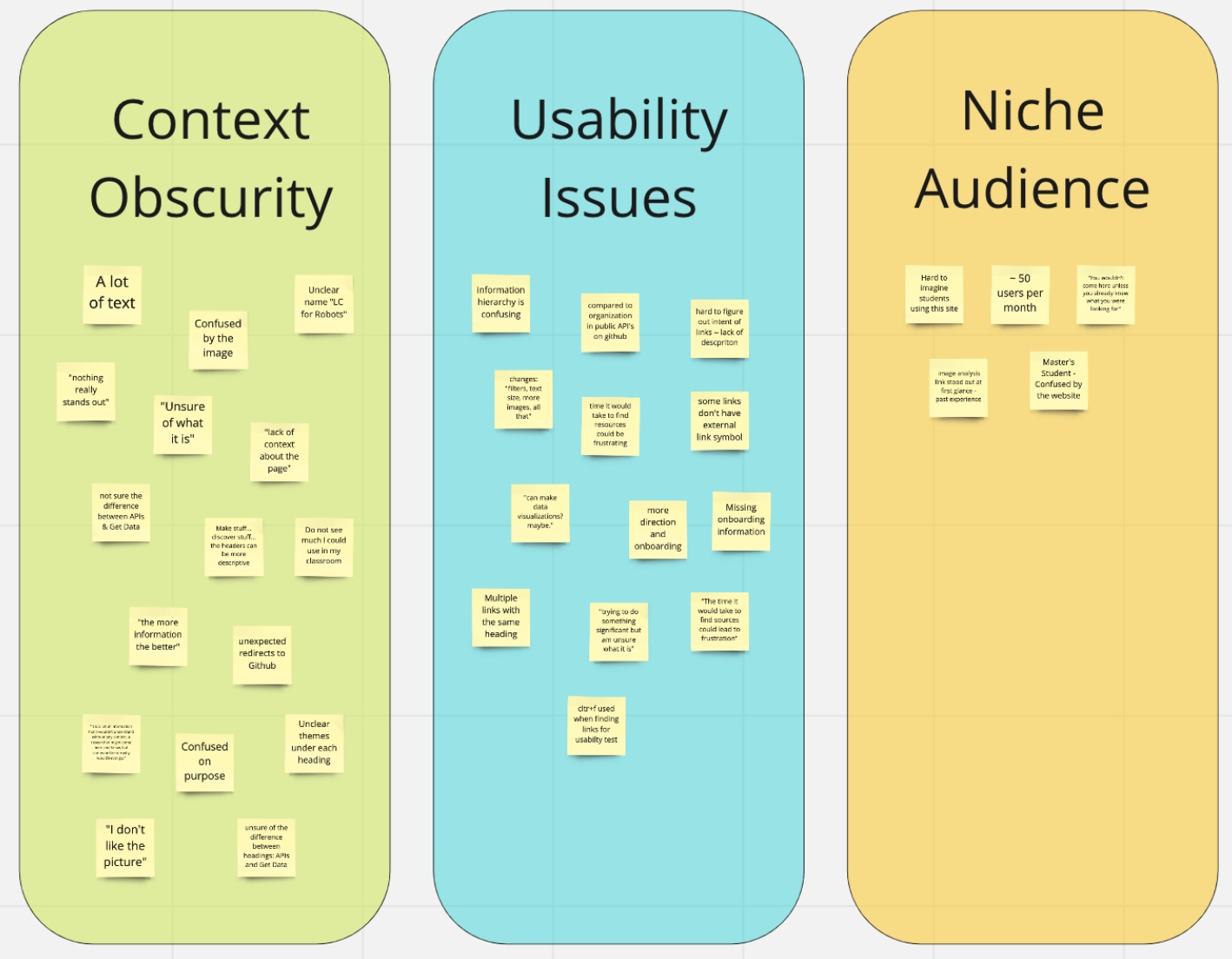
• Causes of user frustration: cluttered text, missing context about the purpose of the site, and confusion about the functionality of APIs and data downloads.
• One experienced non-user participant said, “this website is trying to do something significant but I am unsure of what it is.” The website has a lot to offer but little context to showcase the significance of the resources.
• Another experienced non-user participant expressed that the purpose of the website was unclear for new users, saying “you wouldn’t come here unless you already knew what you were looking for.”
• Motivations for using sites similar to LC for Robots included completing research and school projects.
Card Sorting
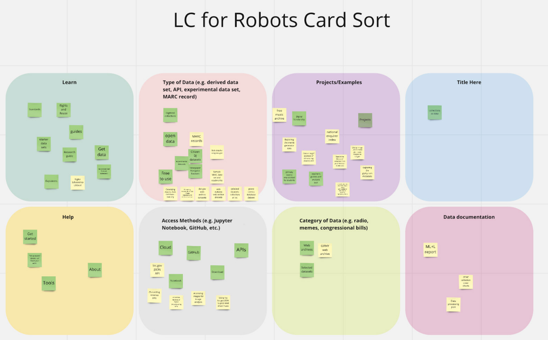
We conducted the card sorting exercise with our UMSI team and two client team members. Our team organized cards and resources for the client’s team to sort and walk us through how they categorized content on LC for Robots.
• This method gave our team a new level of understanding of how the client wants to present and organize the content of LC for Robots.
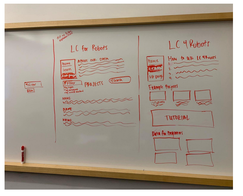
• The card sorting exercise made it clear that filters will be necessary.
Heuristic Evaluation
Web Traffic Analysis
Card Sorting
───────────────
Research Analysis
Affinity Diagramming
After conducting all of our surveys, we extracted all the interview data collected in Google Sheets and transferred them onto a Miro board for affinity diagramming. Doing this helped us to uncover repetitive pain points and recurring themes.
Empathy Mapping
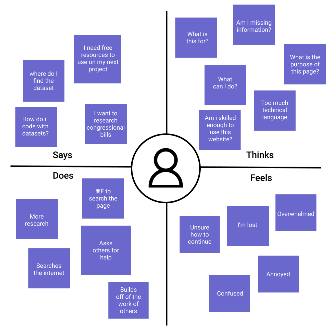
We used the data gathered from the usability tests in order to complete three empathy maps for each of our personas. This synthesized what each of our targeted personas says, thinks, does, and feels about the LC for Robots website and other sites that provide data downloads and APIs. These results gave our team a priority of essential and valuable features to include in the redesign.
Affinity Diagram
Empathy Map
Key Insights
Personas
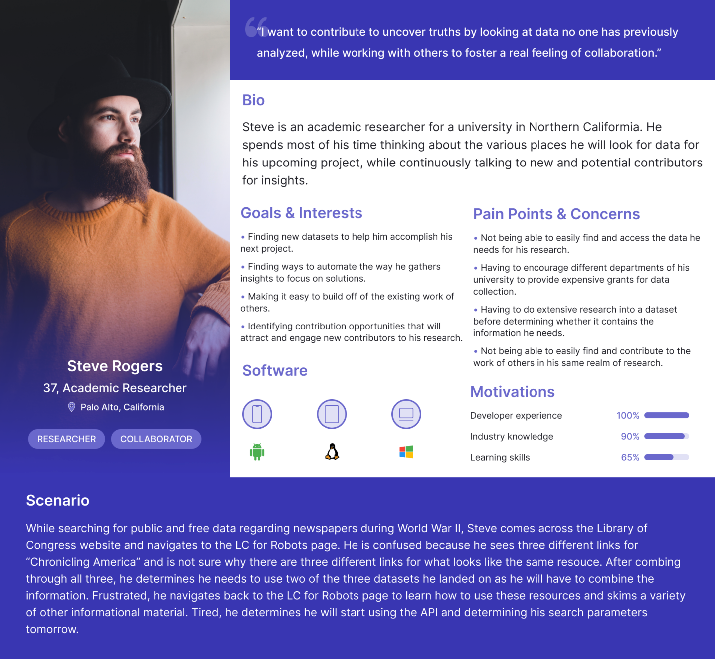
Primary persona, the expert researcher
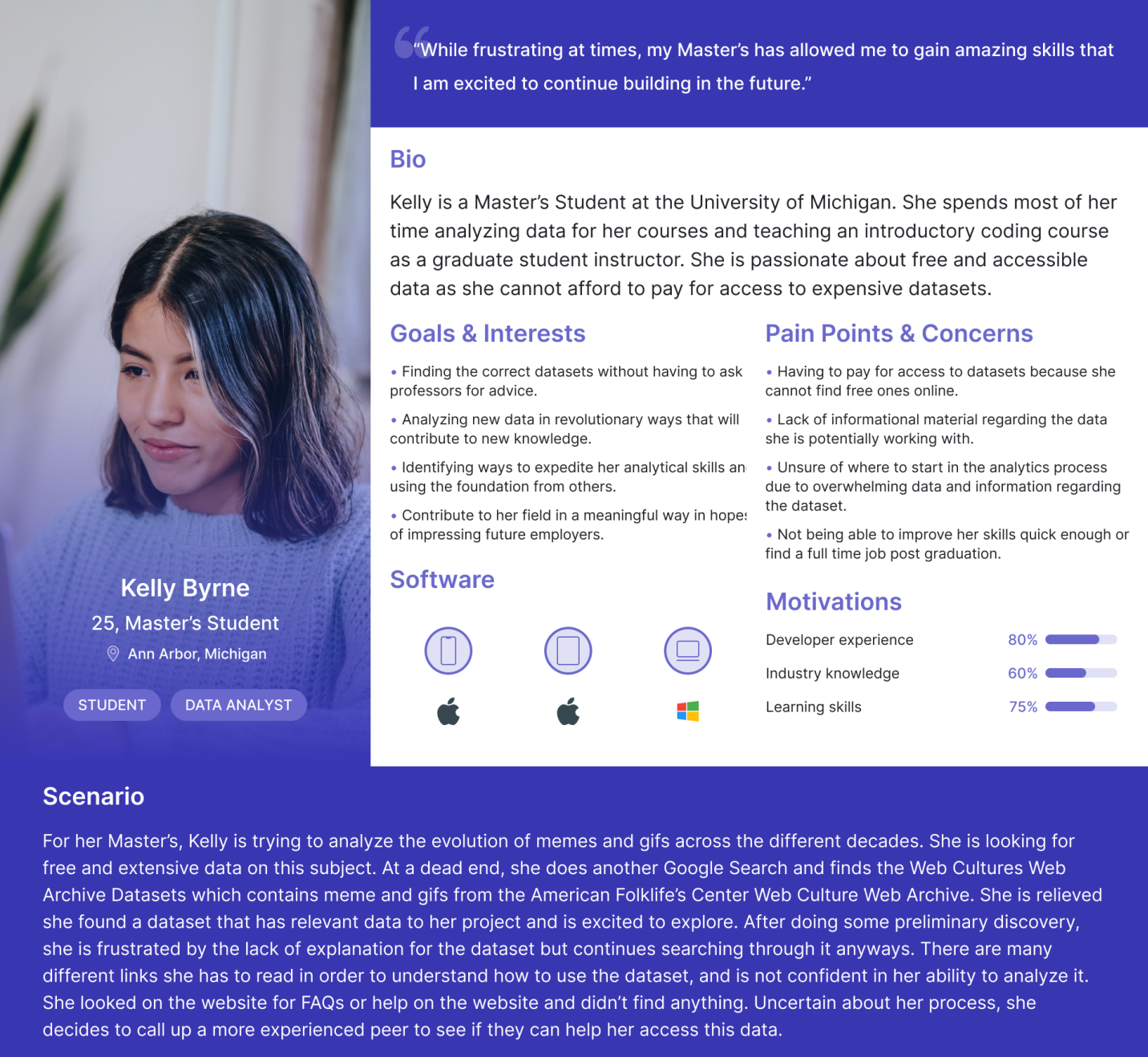
Secondary persona, the semi-pro student
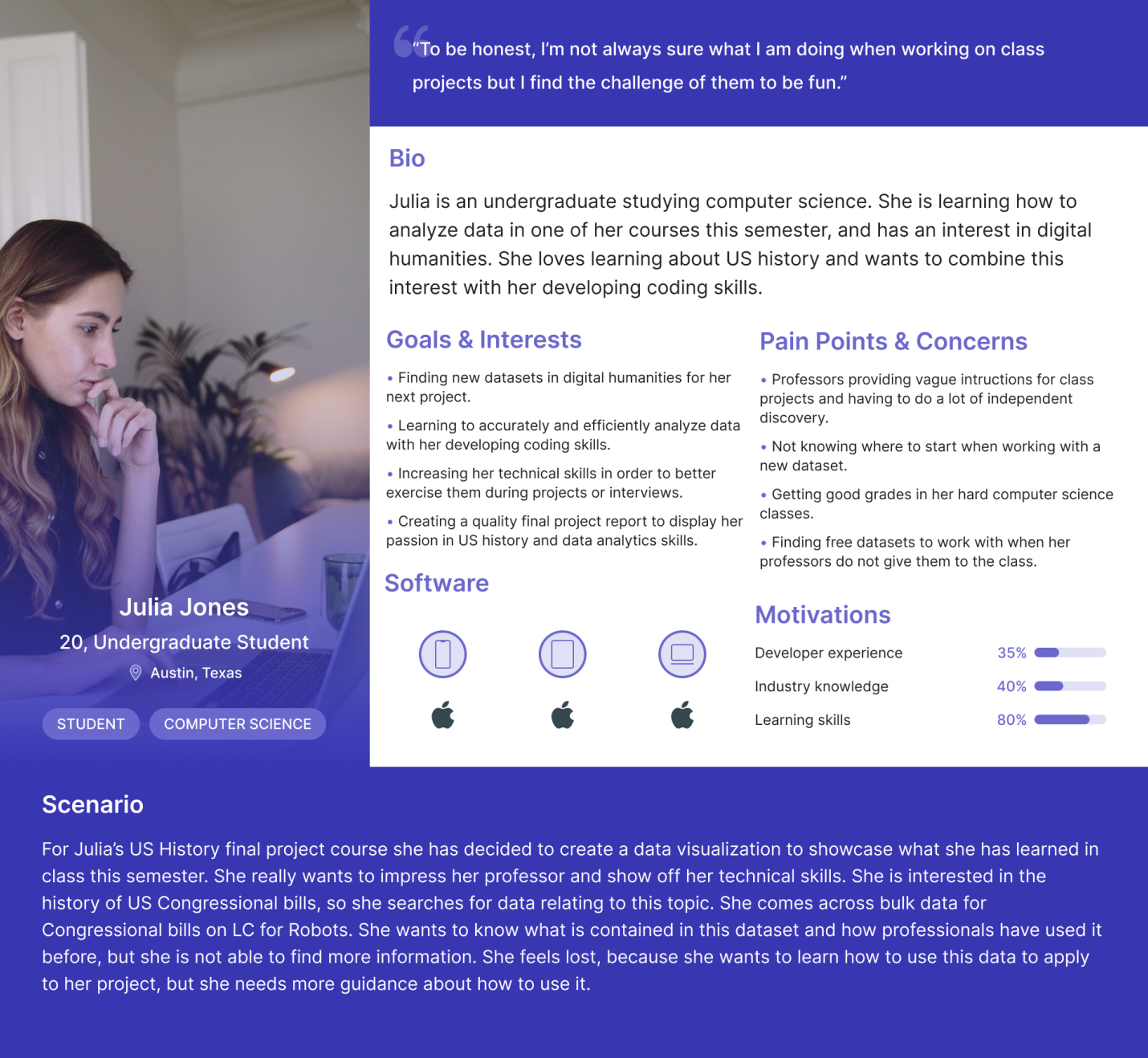
Secondary persona, the novice student
UX Requirements
───────────────
Design Phase
Design Process
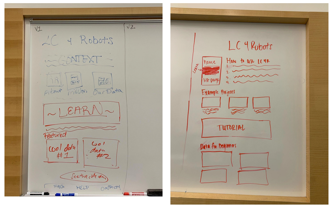
Sketching
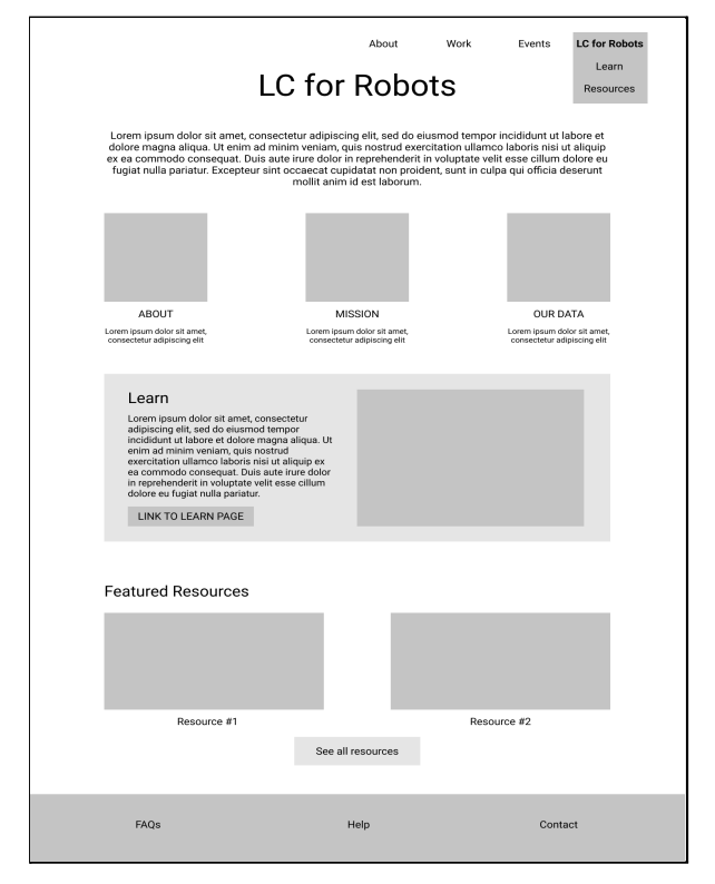
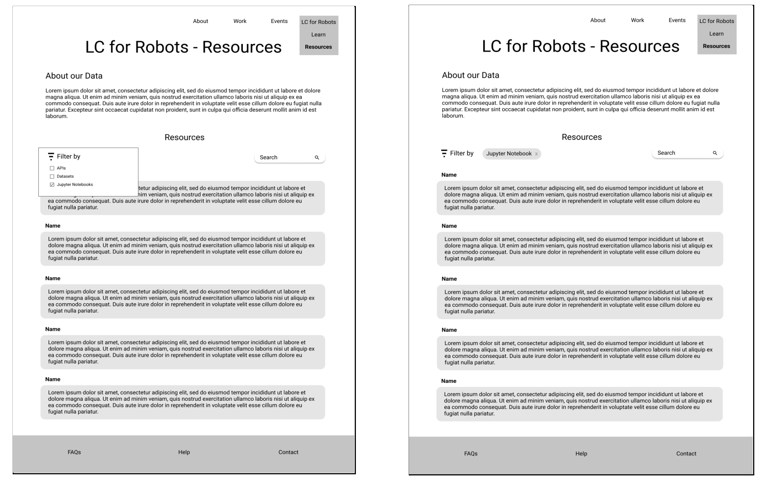
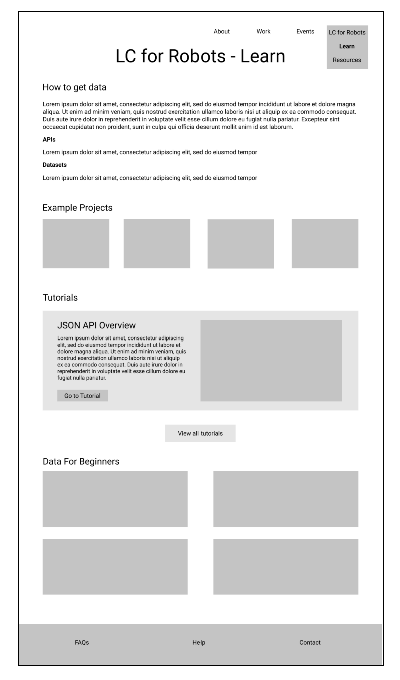
Lo-fi Wireframes
User Testing Results
Our team conducted 5 user testing sessions on the low-fidelity wireframes. After each user test, our team iterated on our designs with the needs of the users at the forefront of our priorities.
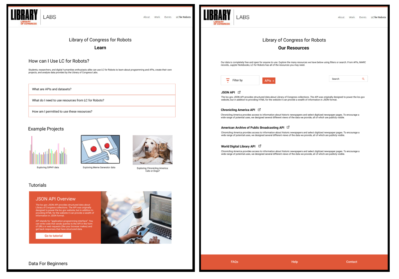
1. The left-aligned navigation menu both cluttered the page and it was unclear where the items took the user.
FIX: Moved the navigation to a drop-down menu in the top bar. Users are brought to the homepage and then are able to navigate to the resources page and learn page through both the navigation drop-down menu and through internal links on the page.
2. The labels in our wireframes were sometimes unclear. The initial wireframe of the homepage boasted both featured resources and an example projects section. User feedback showed that these labels were too similar and confused users.
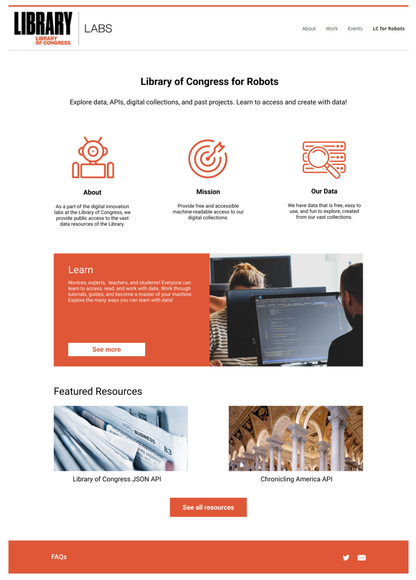
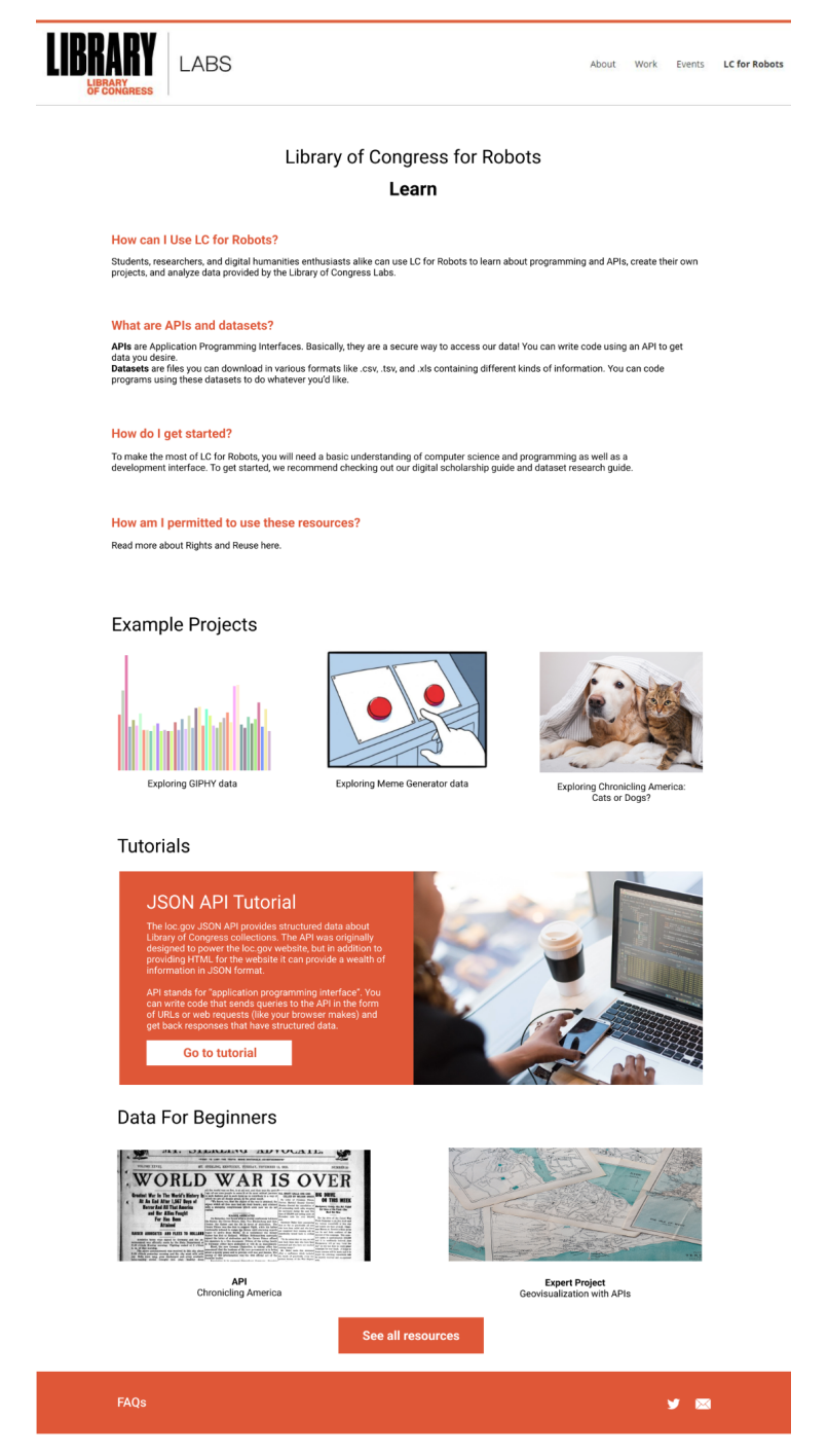
FIX: Separated these sections, so users can now find featured resources on the homepage. These resources will inform users of exciting and engaging projects and content LC Labs is working on. The example projects section was moved to the learn page to encourage users to look at past projects for educational and inspirational purposes.
3. Clickable/unclickable elements were unclear. Our initial wireframes had various clickable elements displayed, such as images, text, and bars. Some users didn’t realize some elements were clickable without direction.
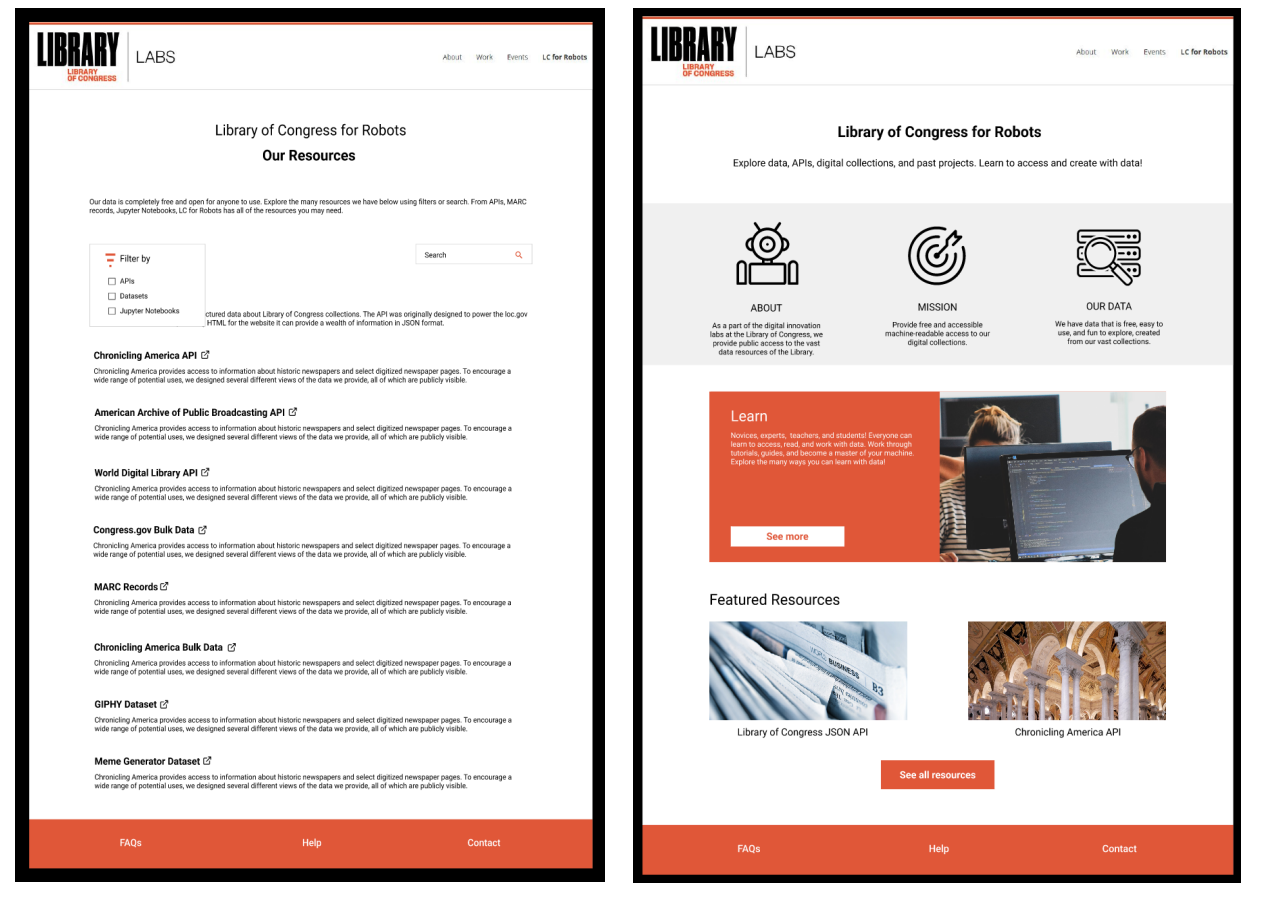
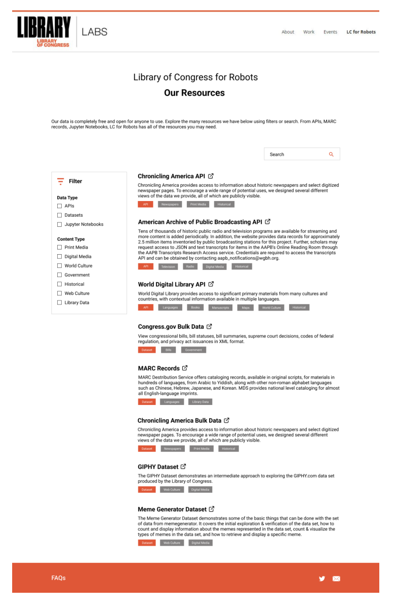
FIX: in developing our final design was to have a concrete and consistent design style for these clickable elements. We utilized the branded orange color and rectangle shapes to define them. Furthermore, we included intuitive icons for better understanding and describing different sections of the LC for Labs overview.
Mid-fi Wireframes
Hi-fi Wireframes
───────────────
Validation Phase
A/B Testing
Research Questions
1. Do users have a better understanding of what LC for Robots does and what resources they offer?
2. Does the new content structure improve users’ ability to learn about and find resources?
3. Does featuring popular resources improve engagement with LC for Robots resources?
4. Does the search and filter system improve the time it takes users to find a specific resource?
5. Are first-time and novice users able to better find information to help them get started finding and using LC for Robots resources?
6. Did users feel confident in their actions with limited errors?
Metrics
1. User feedback (qualitative response)
• Measures how well the user understands the general content provided on the site.
2. Success rate (Y/N)
• Measures whether users can complete typical user tasks and the general usability of the site.
3. Click-through rate (number of clicks/hovers)
• Measures engagement with the site’s featured resources
4. Time to complete (seconds)
• Measures the effectiveness of the new content structure
5. Engagement/time on site (seconds)
• Measures whether users feel comfortable exploring the site’s content
6. User feedback (SUS score)
• Measures satisfaction/perceived usability after the participant completes tasks
A/B Testing Analysis
Statistics for Independent Variables
• Users have more to explore on the new website and therefore spend more time exploring, signaling a better user experience. Users spent an average of 26 seconds more exploring the redesigned website than the current one.
• Using the old website, 2/4 users were able to accurately describe what they could do with a resource.
• Using the new website, 4/4 users were able to accurately describe how they could use a resource.
• Users were able to find resources 14 seconds faster on average.
• Users engaged with getting started materials for 7.65 seconds more on average.
• Users were able to filter by API and find these resources 12.25 seconds faster on average.
• Users were able to find resources related to learning skills 9 seconds faster on average.
Overall, using The System Usability Scale (SUS): Post-Test Assessment of Usability, users found the redesigned website easier to use than the current website. However, it is important to note that the responses for the current website have conflicting responses, with 2 respondents rating the website as relatively difficult to use and 2 respondents rating the website as very easy to use. This discrepancy can be attributed to our demographics of participants - some of the users were expert programmers and existing users of LC for Robots, and some were inexperienced first-time visitors to the website.
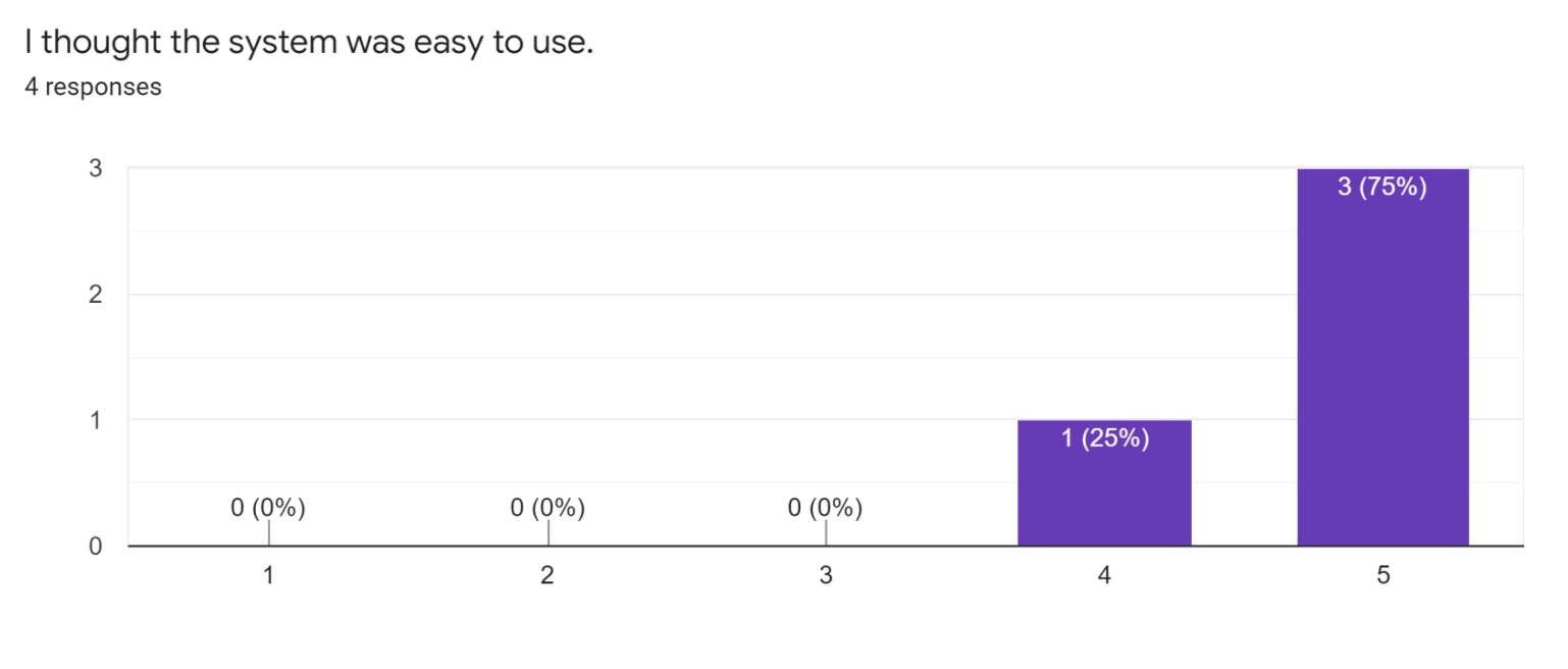
Redesigned Webpage
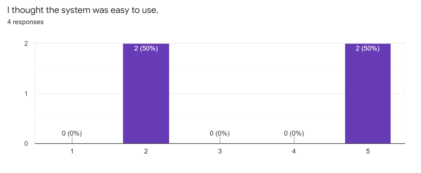
Current Webpage
Adjustments to Design
Feedback from our A/B testing sessions provided us with many areas of improvement which we have implemented in our most recent iteration.
● We added file formats to improve the filtering function on the resources page, as requested by multiple experienced users.
● We created a clear call to action on the home page of LC for Robots following multiple reports of confusion about what actions to take at first glance.
● We added multiple calls to direct expert users straight to the resources page, as our experienced users were uninterested.
───────────────
Interaction Map
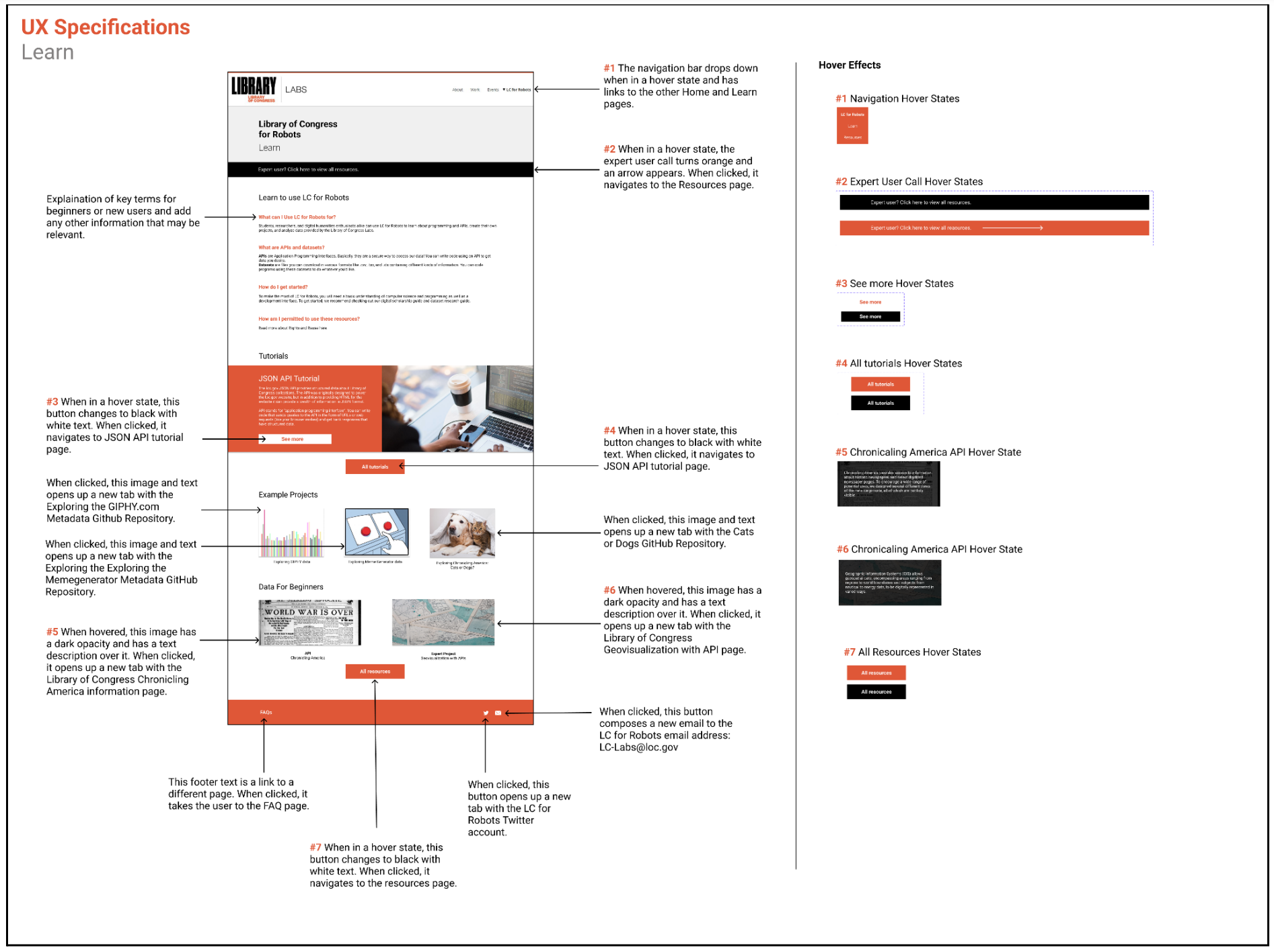
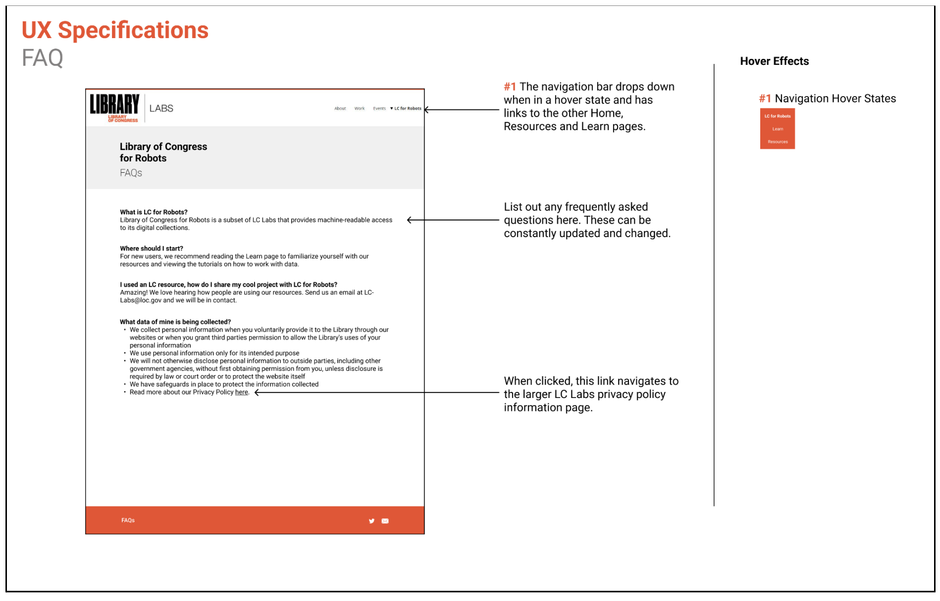
UX Specifications
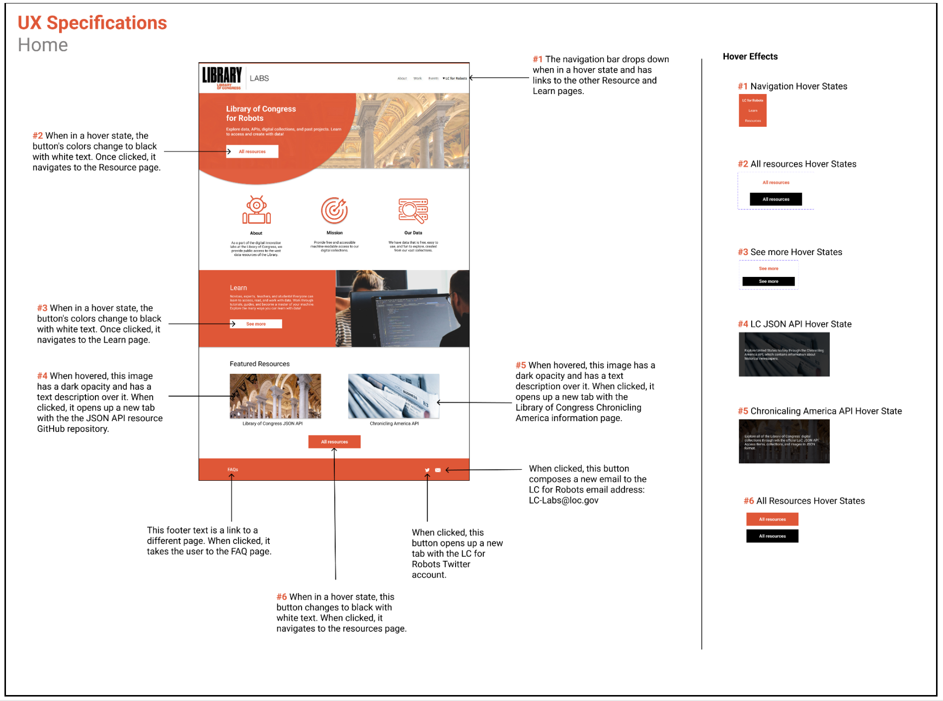
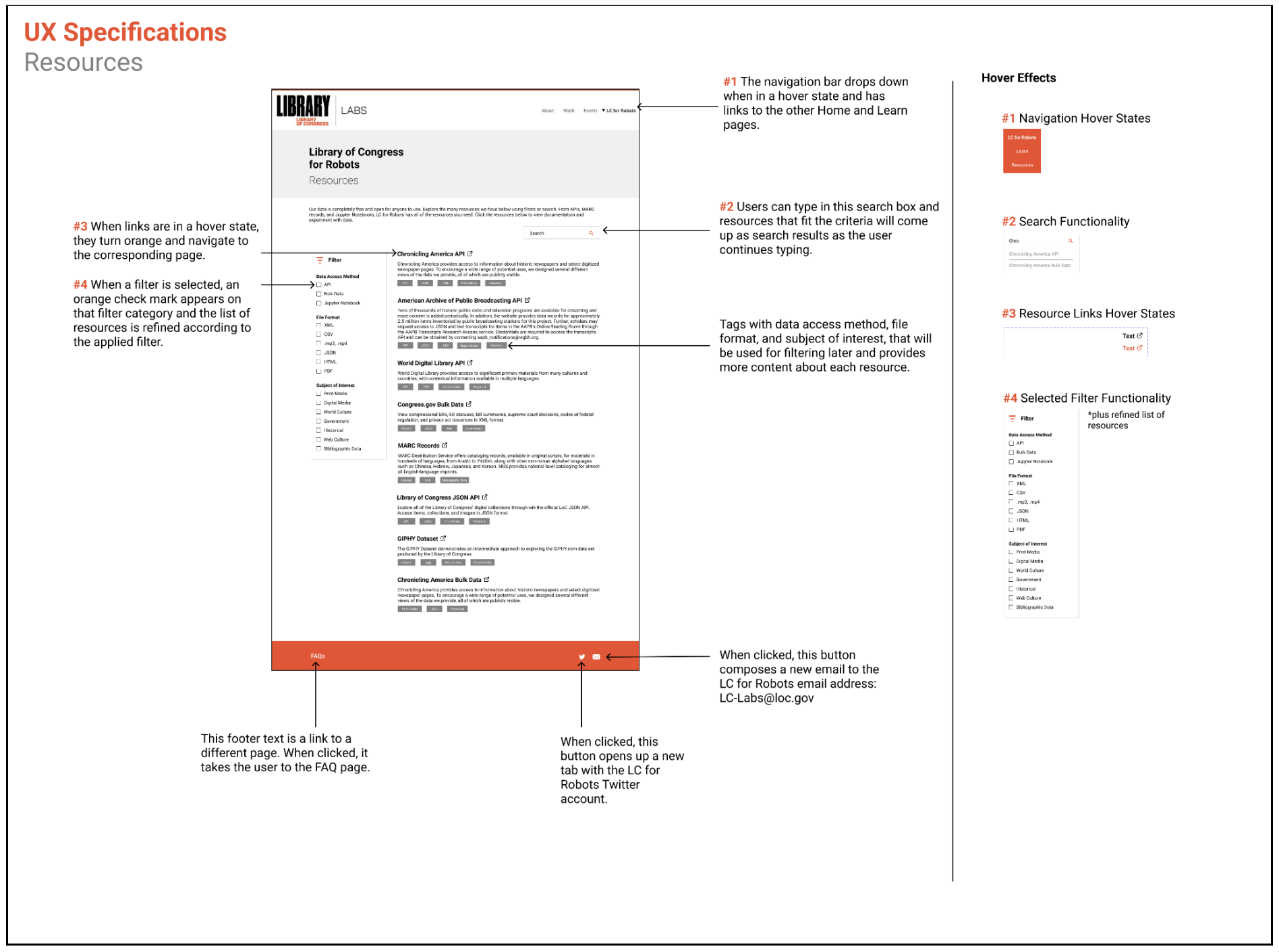
Hi-fi Prototype
